Matplotlib
pip install matplotlibconda install -c conda-forge matplotlib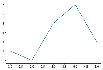
import matplotlib.pyplot as plt
x=[1,2,3,4,5]
y=[2,1,5,7,3]
plt.plot(x,y)
plt.show()
Adding more features to graph
xlable() : Add Lable to X axisylable() : Add Lable to Y axis
title() : Add a title to your graph
grid() : Add grid to graph , plt.grid(True,color='#f1f1f1')
legend(): Show legend on graph
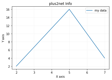
from matplotlib import pyplot as plt
x = [2,5,7]
y = [2,16,4]
plt.plot(x,y,label='my data')
plt.title('plus2net Info')
plt.ylabel('Y axis')
plt.xlabel('X axis')
plt.legend()
plt.grid(True,color='#f1f1f1')
plt.show()One of the important method is plot(), here are different parameters can be used with plot()
plt.plot(x,y,'g',label='my data', linewidth=4)Pie Chart
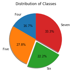
import matplotlib.pyplot as plt

classes = 'Four', 'Five', 'Six', 'Seven'
sizes = [30, 50, 40, 60]
explode = (0, 0, 0.1, 0)
# only "explode" the 3rd slice (i.e. 'Six')

plt.pie(sizes, explode=explode, autopct='%1.1f%%',
        labels=classes,shadow=True, startangle=90)

plt.title("Distribution of Classes")
plt.show()
Bar Chart
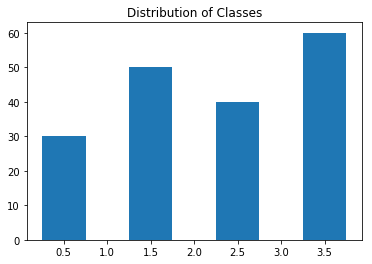
import matplotlib.pyplot as plt

classes = 'Four', 'Five', 'Six', 'Seven'
sizes = [30, 50, 40, 60]

plt.bar([.5,1.5,2.5,3.5], sizes,width=.5)
plt.title("Distribution of Classes")
plt.show()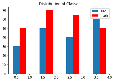
import matplotlib.pyplot as plt

classes = 'Four', 'Five', 'Six', 'Seven'
sizes = [30, 50, 40, 60]
marks=[50,70,65,50]

plt.bar([.5,1.5,2.5,3.5], sizes,width=.25,
        label='size')
plt.bar([.75,1.75,2.75,3.75], marks,
        width=.25,label='mark',color='r')

plt.legend()
plt.title("Distribution of Classes")
plt.show()
Histogram
Shows the frequency of distribution of data. Here we will see how marks are obtained at different rages . Here we can see more marks are obtained by the students in the range 50 to 60.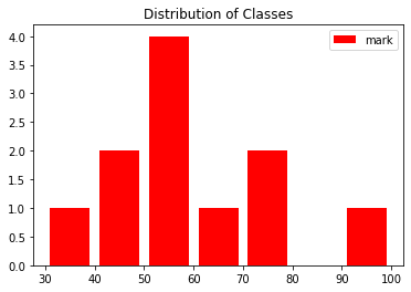
import matplotlib.pyplot as plt
range = [30,40,50,60,70,80,90,100]
marks = [35,55,78,46,48,55,79,95,55,58,65]
plt.hist(marks,range,label='mark',
    color='r', histtype='bar', rwidth=0.8)

plt.legend()
plt.title("Distribution of Classes")
plt.show()Pandas Dataframe Plot

Subhendu Mohapatra
Author
🎥 Join me live on YouTubePassionate about coding and teaching, I publish practical tutorials on PHP, Python, JavaScript, SQL, and web development. My goal is to make learning simple, engaging, and project‑oriented with real examples and source code.
Subscribe to our YouTube Channel here
This article is written by plus2net.com team.
https://www.plus2net.com

 Python Video Tutorials