Pandas DataFrame Plot bar graph
Python Pandas Plot horizontal or vertical Bar graph by using DataFrame with options & save as image
Pandas.DataFrame.plot to get bar graphs using data
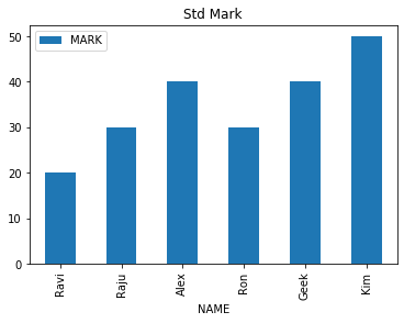
Let us create a DataFrame with name of the students and their marks.
import pandas as pd
my_dict={
'NAME':['Ravi','Raju','Alex',
        'Ron','Geek','Kim'],
'MARK':[20,30,40,30,40,50]
}
df = pd.DataFrame(data=my_dict)
df.plot.bar(title="Std Mark",
            x='NAME')
Bar Graph with options
There are several options we can add to above bar graph.title :
title='Student Mark' String used as Title of the graph. We can also use one list to give titles to sub graphs. ( for this subplot must be true )figsize :
Size of the graph , it is a tuple saying width and height in inches, figsize=(6,3). Here width is 6 inches and height is 3 inches.X: Y:
What is to be used in X and Y axis. If you have multiple keys then you can specify what can be used. Note that Y axis must be numeric data to plot the graph.Example : Here we have used y='MARK' to plot the graph against the name of students ( x='NAME' )
df.plot.bar(title="Std Mark",x='NAME',y='MARK',figsize=(6,3));use_index
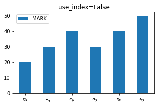
True or False ( default is True ) , To show index ( use_index = True) or not ( use_index = False). The difference is mentioned here ( check X - axis ) .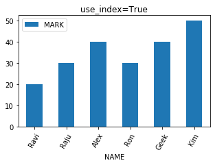
grid
We will show grid ( grid=True ) or not ( grid=False)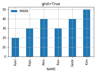

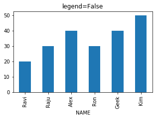
legend
True of False ( default is True ), to show legend ( legend=True ) or not ( legend=False)
color
The colour of the bar we can define by using list. We have to give our inputs in R G B where each value varies from 0 to 1. Here is one sample.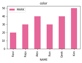 code is here .
my_colors=[(0.9,0.4,0.6)]
df.plot.bar(title="color",x='NAME',
            y='MARK',figsize=(5,3),
            color=my_colors)
We can define more colours in combination of RGB and use them.
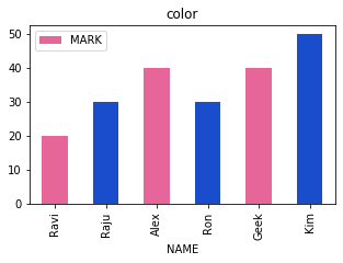
my_colors=[(.9,.4,.6),(.1,.3,.8)]
df.plot.bar(title="color",x='NAME',
            y='MARK',figsize=(5,3),
            color=my_colors)
We can define different colours to each bar of the graph. We will prepare a list of different colours for each bar.
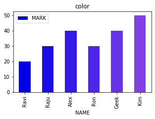
my_colors = [(x/10.0, x/20.0, .9)
        for x in range(len(df))]
df.plot.bar(title="color",x='NAME',
            y='MARK',figsize=(5,3),
            color=my_colors)
logx logy loglog
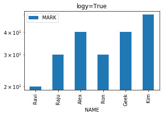 We can specify log scaling or symlog scaling for x ( logx=True ) or y ( logy=True ) or for both x & y ( loglog=True)
df.plot.line( title="logy=True",logy=True)secondary_y
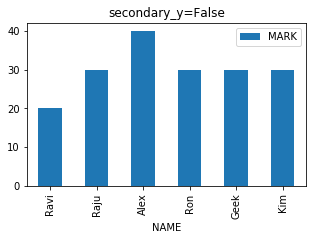
Whether to plot on secondary Y Axis ( secondary_y=True ) or not ( secondary_y=False )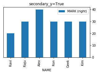
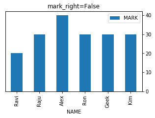
mark_right
Check the image above when secondary_y=True. There is a automatic marking in column lebels saying (right). We can manage this to show ( mark_right=True) or not ( mark_right=False)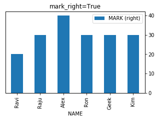
df.plot.bar( title="secondary_y=True",x='NAME',figsize=(5,3),secondary_y=True)rot
Rotation of ticks ( check the names at x axis )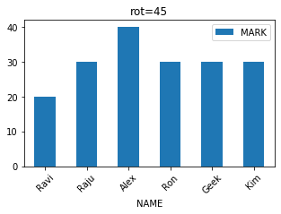
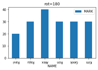
df.plot.bar( title="rot=180",x='NAME',figsize=(5,3),rot=180)stacked
We can make bars stacked one over other ( stacked=True ) or not to draw side by side ( stacked=False)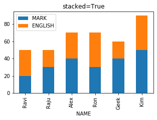
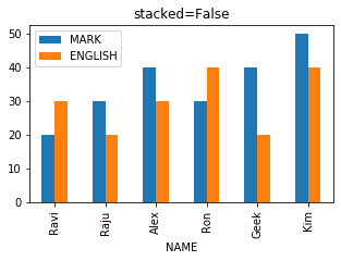
import pandas as pd
my_dict={
'NAME':['Ravi','Raju','Alex',
        'Ron','Geek','Kim'],
'MARK':[20,30,40,30,40,50],
'ENGLISH':[30,20,30,40,20,40]
}
df = pd.DataFrame(data=my_dict)
df.plot.bar(title="stacked=True",x='NAME',figsize=(5,3),stacked=True)Pie plot Line plot Box plot Density plot Area plot Scatter Plot Hexbin plot

Subhendu Mohapatra
Author
🎥 Join me live on YouTubePassionate about coding and teaching, I publish practical tutorials on PHP, Python, JavaScript, SQL, and web development. My goal is to make learning simple, engaging, and project‑oriented with real examples and source code.
Subscribe to our YouTube Channel here
This article is written by plus2net.com team.
https://www.plus2net.com

 Python Video Tutorials