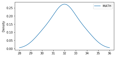
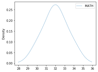
Pandas DataFrame Plot density graph
import pandas as pd
my_dict={
'MATH':[30,33,32,32,31,34,32]
}
df=pd.DataFrame(data=my_dict)
df.plot.density()
density chart with options
There are several options we can add to above density diagram.title :
title='Student Mark' String used as Title of the graph.figsize :
Size of the graph , it is a tuple saying width and height in inches, figsize=(6,3). Here width is 6 inches and height is 3 inches.
df.plot.density(figsize=(6,3))fontsize
fontsize=20 , we can set the font size used labels in x and y axis.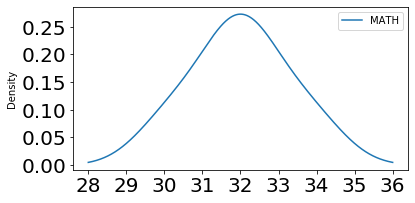
df.plot.density(fontsize=20)color
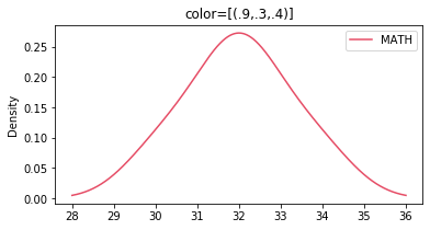 We can use the option colors to give different colors to line . We can use one tuple to define the colours.
df.plot.density(color=[(.9,.3,.4)])style
This is a list or dict. We can specify how the style of the line.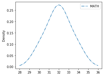
my_style=['-.']
#my_style=[':']
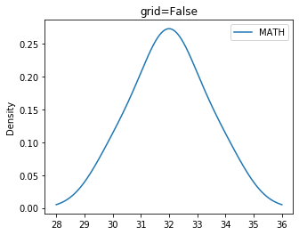
df.plot.density(style=my_style)grid
We will show grid ( grid=True ) or not ( grid=False)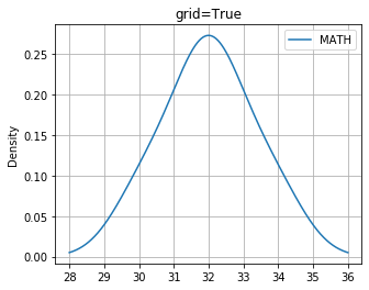
logx logy loglog
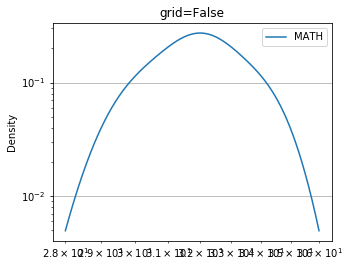 We can specify log scaling or symlog scaling for x ( logx=True ) or y ( logy=True ) or for both x & y ( loglog=True)
df.plot.density(loglog=True)secondary_y
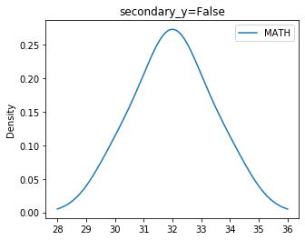
Whether to plot on secondary Y Axis ( secondary_y=True ) or not ( secondary_y=False )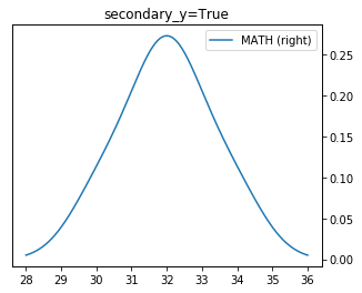
df.plot.density(secondary_y=True)mark_right
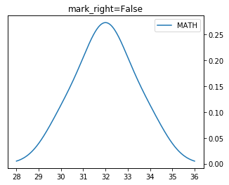
Check the image above when secondary_y=True. There is a automatic marking in column lebels saying (right). We can manage this to show ( mark_right=True) or not ( mark_right=False)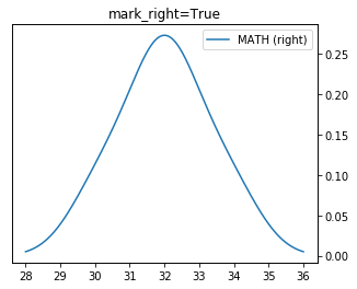
df.plot.density(mark_right=True,secondary_y=True)rot
Rotation of ticks ( check the label at x axis )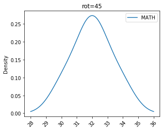
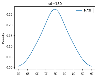
df.plot.density(title='rot=180',figsize=(5,4),rot=180)
Subhendu Mohapatra
Author
🎥 Join me live on YouTubePassionate about coding and teaching, I publish practical tutorials on PHP, Python, JavaScript, SQL, and web development. My goal is to make learning simple, engaging, and project‑oriented with real examples and source code.
Subscribe to our YouTube Channel here
This article is written by plus2net.com team.
https://www.plus2net.com

 Python Video Tutorials