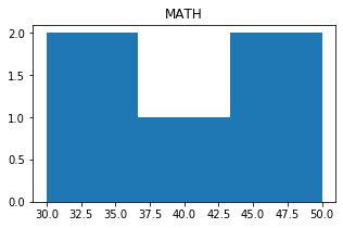
Pandas DataFrame Plot histogram graph
Let us create a DataFrame with name of the students and their marks.
import pandas as pd
my_dict={
'NAME':['Ravi','Raju','Alex',
'Ron','Tor'],
'MATH':[30,40,50,30,50]
}
df = pd.DataFrame(data=my_dict)
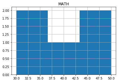
df.hist(bins=3)histogram with options
There are several options we can add to above histogram.bin
default value is 10, number of bins to be used in histogram.xrot yrot
xrot=45 Rotation of x axis labels in degree. yrot=180 Rotation of y axis lables in degree.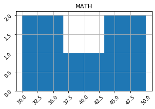
df.hist(bins=3,xrot=45,yrot=45)
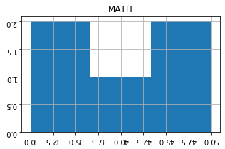
df.hist(bins=3,xrot=180,yrot=180)figsize :
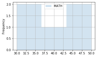
Size of the graph , it is a tuple saying width and height in inches, figsize=(6,3). Here width is 6 inches and height is 3 inches.df.hist(bins=3,figsize=(6,3));grid
We will show grid ( grid=True ) or not ( grid=False)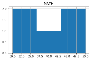
secondary_y
Whether to plot on secondary Y Axis ( secondary_y=True ) or not ( secondary_y=False )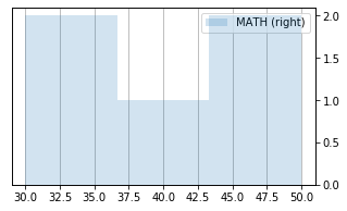
mark_right
Check the image above when secondary_y=True. There is a automatic marking in column lebels saying (right). We can manage this to show ( mark_right=True) or not ( mark_right=False)
df.hist( figsize=(5,3),secondary_y=True, mark_right=True)color
The colour of the histogram we can define by using list. We have to give our inputs in R G B where each value varies from 0 to 1. Here is one sample.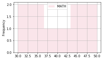
import pandas as pd
my_dict={
'NAME':['Ravi','Raju','Alex',
        'Ron','Tor'],
'MATH':[30,40,50,30,50]
}
df = pd.DataFrame(data=my_dict)
df.plot.hist(bins=3,figsize=(5,3),
    grid=True,alpha=0.2,
             color=[(.9,.5,.6)])
logx logy loglog
We can specify log scaling or symlog scaling for x ( logx=True ) or y ( logy=True ) or for both x & y ( loglog=True)df.plot.hist(bins=3,figsize=(5,3),
grid=True,alpha=0.2,logx=True,logy=True,loglog=True)
Subhendu Mohapatra
Author
🎥 Join me live on YouTubePassionate about coding and teaching, I publish practical tutorials on PHP, Python, JavaScript, SQL, and web development. My goal is to make learning simple, engaging, and project‑oriented with real examples and source code.
Subscribe to our YouTube Channel here
This article is written by plus2net.com team.
https://www.plus2net.com

 Python Video Tutorials