Pandas Scatter Plots: Correlation, Point Sizes and Colors
Use DataFrame.plot.scatter() (or df.plot(kind='scatter')) to examine relationships, correlations, and cluster patterns between two continuous numerical variables. Unlike line or bar charts, scatter plots strictly require both an x= and a y= column. Learn how to customise point colors, encode a third variable using point sizes (bubble charts) or colormaps, apply logarithmic scaling, and export publication-ready chart images.
Create a basic scatter plot (x vs y) 🔝
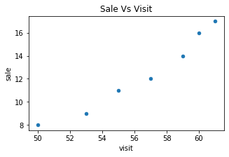
In Pandas, calling df.plot.scatter() requires specifying both x='col1' and y='col2'. Here we plot website visits against sales to explore how customer footfall relates to purchase volume.
import pandas as pd
import matplotlib.pyplot as plt

my_dict = {
    "visit": [50, 53, 55, 57, 59, 60, 61],
    "sale": [8, 9, 11, 12, 14, 16, 17]
}
df = pd.DataFrame(data=my_dict)
print(df)

# Plot scatter chart
df.plot.scatter(x="visit", y="sale", title="Sale Vs Visit", figsize=(6, 3))
plt.show()
Expected console output:
   visit  sale
0     50     8
1     53     9
2     55    11
3     57    12
4     59    14
5     60    16
6     61    17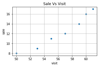
Customise point colors and transparency 🔝
You can set point colors using named color strings (e.g. color='darkorange') or RGB tuples. When data points overlap heavily, add alpha=0.6 to make point density visible.
# Custom point color with RGB tuple
df.plot.scatter(x="visit", y="sale", title="Custom Colored Points", color=[(0.9, 0.4, 0.2)], figsize=(6, 3))
plt.show()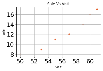
Map a third numerical variable with colormaps (c=) 🔝
To reveal a third dimension without adding a 3D axis, pass a numerical column name to c=. Pandas will shade each point according to that column's value and automatically generate a colorbar scale.
# Color points by value gradient with a colormap
df.plot.scatter(x="visit", y="sale", c="sale", colormap="viridis", title="Sales Gradient", figsize=(7, 4))
plt.show()
Create bubble charts using dynamic point sizes (s=) 🔝
A bubble chart is a scatter plot where the size of each dot reflects another measure. Pass an array or scaled column to s= to scale markers proportionally.
# Size markers proportionally to sales volume
df.plot.scatter(x="visit", y="sale", s=df["sale"] * 20, title="Bubble Chart: Sales Volume", alpha=0.6, figsize=(7, 4))
plt.show()
Adjust figure dimensions and label font size 🔝
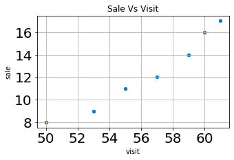
Control the size of the canvas using figsize=(width, height) and change tick label font sizing using fontsize=20.
Enable and format gridlines 🔝
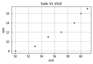
Toggle gridlines using grid=True or grid=False to help readers trace coordinate positions accurately.
Handle exponential scales with logx, logy, and loglog 🔝
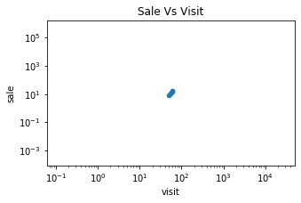
When coordinates span several orders of magnitude (for example, web impressions in millions compared to sales in tens), apply logarithmic scaling using logx=True, logy=True, or loglog=True.
Rotate axis labels with rot 🔝
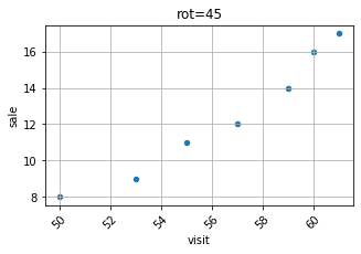
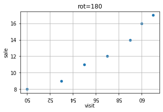
Rotate numerical or date tick marks using rot=45 or rot=90 to avoid overlapping labels on narrow screens.
Save scatter plots to file using savefig() 🔝
Save your plot as a publication-ready image file before closing the figure buffer:
ax = df.plot.scatter(x="visit", y="sale", title="Store Traffic vs Sales")
plt.tight_layout()
plt.savefig("scatter_sales_trend.png", dpi=300)
print("Saved chart as scatter_sales_trend.png")
plt.close()
Practical workflow: marketing ad spend vs conversions vs revenue 🔝
In this workflow, we analyze digital marketing campaigns across channels. We plot Ad Spend on the X-axis, Conversions on the Y-axis, and encode Revenue into the colorbar gradient.
import pandas as pd
import matplotlib.pyplot as plt

campaigns = pd.DataFrame({
    "Campaign": ["Email", "Search", "Social", "Display", "Affiliate"],
    "Ad_Spend": [500, 1500, 1200, 800, 600],
    "Conversions": [45, 130, 95, 50, 40],
    "Revenue": [4500, 14500, 10200, 4800, 3900]
})

# Validate dataset
assert len(campaigns) == 5
assert campaigns["Ad_Spend"].sum() == 4600
assert campaigns["Revenue"].sum() == 37900
print("Total Ad Spend:", campaigns["Ad_Spend"].sum())
print("Total Revenue:", campaigns["Revenue"].sum())

# Plot 3-dimensional scatter (Spend vs Conversions with Revenue gradient)
ax = campaigns.plot.scatter(
    x="Ad_Spend",
    y="Conversions",
    c="Revenue",
    colormap="viridis",
    s=100,
    figsize=(8, 5),
    title="Campaign Spend vs Conversions (Color = Revenue)",
    grid=True
)
plt.show()
Expected console output:
Total Ad Spend: 4600
Total Revenue: 37900
Exercise: ad impressions vs click performance 🔝
Create a DataFrame representing 5 online ads with columns: Ad_ID ([1, 2, 3, 4, 5]), Impressions ([1000, 2500, 4000, 6000, 8500]), and Clicks ([25, 60, 110, 175, 260]). Plot a scatter chart of Impressions on the X-axis vs Clicks on the Y-axis with gridlines, title the plot "Ad Clicks vs Impressions", and verify total clicks.
Exercise solution 🔝
import pandas as pd
import matplotlib.pyplot as plt

ads = pd.DataFrame({
    "Ad_ID": [1, 2, 3, 4, 5],
    "Impressions": [1000, 2500, 4000, 6000, 8500],
    "Clicks": [25, 60, 110, 175, 260]
})

total_clicks = ads["Clicks"].sum()
assert total_clicks == 630
print("Total Clicks:", total_clicks)

ads.plot.scatter(
    x="Impressions",
    y="Clicks",
    title="Ad Clicks vs Impressions",
    grid=True,
    color="teal",
    s=60,
    figsize=(6, 3)
)
plt.show()
Expected console output:
Total Clicks: 630Practice in Google Colab 🔝
Open in Google Colab View on GitHub
Run the scatter plot examples interactively, experiment with custom colormaps, test bubble chart sizing, and verify the practice exercise directly in Google Colab. All sample datasets are embedded directly in the notebook.
Further Reading & Related Tutorials 🔝
Continue expanding your Pandas data visualization toolkit:
- Pandas Plot Overview — The full guide to Pandas charting formats and settings.
- Pandas Line Charts — Compare trends and continuous measurements over time.
- Pandas Bar Charts — Display category totals, grouped bars, and stacked proportions.
- Pandas Area Plots — Track cumulative volume and stacked part-to-whole proportions.
- Pandas Hexbin Plots — Efficiently visualise point density for large datasets where scatter points overlap.
- Pandas Plotting Exercises — Hands-on problem sets to test your visualization skills.
- SQL SELECT Queries — Learn how to query and filter raw datasets from database tables before plotting.
- Pandas Section Home — Master index of all Pandas pillars, tutorials, and workflows.
Reference: Pandas DataFrame.plot.scatter official documentation.

Subhendu Mohapatra
Author & Instructor at plus2net
I write and maintain practical tutorials on Python, PHP, SQL, JavaScript, HTML, jQuery, and web development at plus2net. The tutorials focus on clear explanations, working examples, and code that readers can test and adapt while learning.


Subscribe to our YouTube Channel here

 Python Video Tutorials