Bar charts in PDF file
Vertical and horizontal bar charts with stacked style to add in PDF file by using Python ReportLab
Vertical Bar chart
from reportlab.graphics.charts.barcharts import VerticalBarChartdata = [
(13, 15, 20, 22, 37, 42, 19, 4),
(14, 16, 21, 23, 38, 41, 20, 5)
]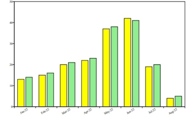
In this format we can collect sample data from SQLite or MySQL database and display the graph.
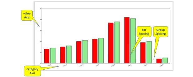
Category Axis and Value Axis
Full code is here. Different options are explained using the comment section.
from reportlab.lib import colors
my_path='G:\\My drive\\testing\\pypdf2\\my_pdf.pdf'
from reportlab.graphics.shapes import Drawing
from reportlab.graphics.charts.barcharts import VerticalBarChart
d = Drawing(600, 400) # width , height
bc = VerticalBarChart()
data = [
 (13, 15, 20, 22, 37, 42, 19, 4),
 (14, 16, 21, 23, 38, 41, 20, 5)
]
bc.x = 50 # horizontal position
bc.y = 50 # vertical position
bc.height = 340 # height of the chart area
bc.width = 530 # width of the chart area
bc.data = data
bc.strokeColor = colors.black # bar edges colour
bc.bars[0].fillColor = colors.yellow # first member of group bar
bc.bars[1].fillColor = colors.lightgreen # second member of group
bc.groupSpacing = 10 # gap between groups
bc.barSpacing = 2.5 # gap within groups ( among members )
bc.valueAxis.valueMin = 0 # value Axis
bc.valueAxis.valueMax = 50
bc.valueAxis.valueStep = 10
bc.categoryAxis.labels.boxAnchor = 'ne'
bc.categoryAxis.labels.dx = 5
bc.categoryAxis.labels.dy = -2
bc.categoryAxis.labels.angle = 30
#bc.categoryAxis.style = 'stacked' # stacked bar graph, parallel
bc.categoryAxis.categoryNames = ['Jan-22','Feb-22','Mar-22',
'Apr-22','May-22','Jun-22','Jul-22','Aug-22']
d.add(bc, '')
from reportlab.graphics import renderPDF
renderPDF.drawToFile(d, my_path, '')Background colour of the chart
bc.fillColor=colors.yellow # background colourColour of bars
bc.bars[0].fillColor=colors.yellow #first member of group bar
bc.bars[1].fillColor=colors.lightgreen # second member of group bar
Colour of individual bar
bc.bars[(0, 0)].fillColor = colors.blue # left bar of first group
bc.bars[(0, 1)].fillColor = colors.yellow # left bar of second group
bc.bars[(1,2)].fillColor=colors.red # right bar of 3rd group
Horizontal bar chart
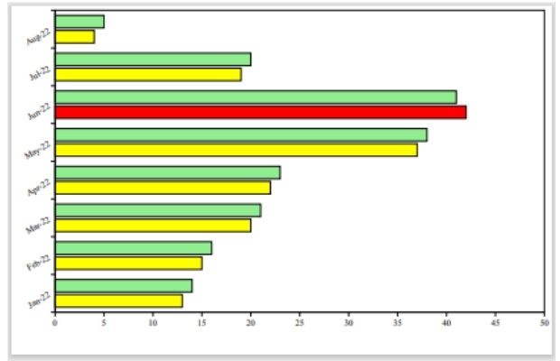
from reportlab.lib import colors
my_path='G:\\My drive\\testing\\pypdf2\\my_pdf.pdf'
from reportlab.graphics.shapes import Drawing
from reportlab.graphics.charts.barcharts import HorizontalBarChart
d=Drawing(620,400) # width , height
#bc=VerticalBarChart()
bc=HorizontalBarChart()
data = [
 (13, 15, 20, 22, 37, 42, 19, 4),
 (14, 16, 21, 23, 38, 41, 20, 5)
]
bc.x = 50  # horizontal position
bc.y = 50  # vertical position
bc.height = 345 # height of the chart area
bc.width = 545  # width of the chart area
bc.data = data
bc.strokeColor = colors.black
#bc.fillColor=colors.yellow
bc.bars[0].fillColor=colors.yellow
bc.bars[1].fillColor=colors.lightgreen
bc.bars[(0,5)].fillColor=colors.red
bc.groupSpacing = 8
bc.barSpacing = 2
bc.valueAxis.valueMin = 0
bc.valueAxis.valueMax = 50
bc.valueAxis.valueStep = 5
bc.categoryAxis.labels.boxAnchor = 'ne'
bc.categoryAxis.labels.dx = -10
bc.categoryAxis.labels.dy = 5
bc.categoryAxis.labels.angle = 30
bc.categoryAxis.categoryNames = ['Jan-22','Feb-22','Mar-22',
 'Apr-22','May-22','Jun-22','Jul-22','Aug-22']
d.add(bc, '')

from reportlab.graphics import renderPDF
renderPDF.drawToFile(d, my_path, '')
Stacked chart
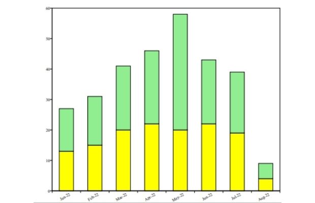
Default value is parallel
bc.categoryAxis.style='stacked'Python PDF Shapes in PDF Line charts in PDF Pie Charts
PDF Mark sheet by using data from SQLite database

Subhendu Mohapatra
Author
🎥 Join me live on YouTubePassionate about coding and teaching, I publish practical tutorials on PHP, Python, JavaScript, SQL, and web development. My goal is to make learning simple, engaging, and project‑oriented with real examples and source code.
Subscribe to our YouTube Channel here
This article is written by plus2net.com team.
https://www.plus2net.com

 Python Video Tutorials