Line charts in PDF file
Adding line chart to PDF file with options to change the width, color and layout by Python ReportLab
Horizontal Line chart
from reportlab.graphics.charts.linecharts import HorizontalLineChartdata = [
(13, 5, 20, 22, 37, 45, 19, 4),
(5, 20, 46, 38, 23, 21, 6, 14)
]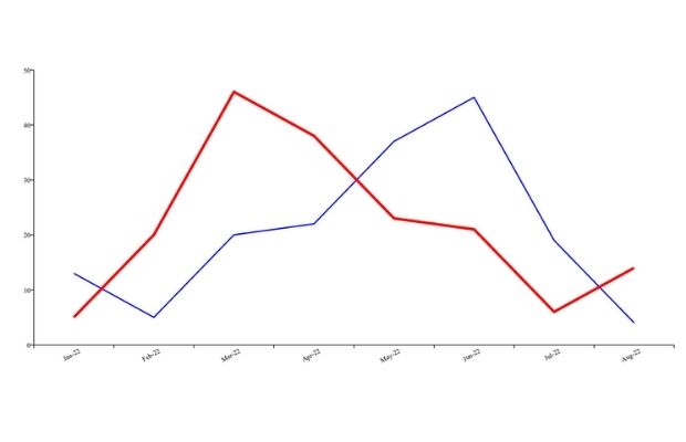
In this format we can collect sample data from SQLite or MySQL database and display the graph.
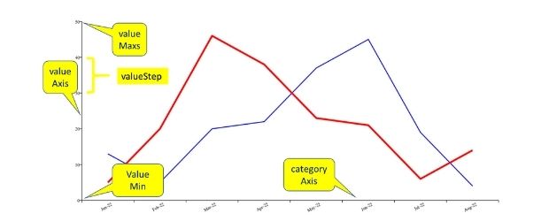
Category Axis and Value Axis
Full code is here. Different options are explained using the comment section.
from reportlab.lib import colors
my_path='G:\\My drive\\testing\\pypdf2\\my_pdf.pdf'
from reportlab.graphics.shapes import Drawing
from reportlab.graphics.charts.linecharts import HorizontalLineChart
d=Drawing(1000,500) # width , height
lc=HorizontalLineChart()
data = [
 (13, 5, 20, 22, 37, 45, 19, 4),
 (5, 20, 46, 38, 23, 21, 6, 14)
]
lc.x = 50 # horizontal position
lc.y = 50 # vertical position
lc.height = 400 # height of the chart area
lc.width = 930 # width of the chart area
lc.data = data
lc.lines[0].strokeWidth=2 # width of the line 1
lc.lines[1].strokeWidth=4 # width of the line 2
lc.lines[0].strokeColor=colors.blue # line colour
lc.lines[1].strokeColor=colors.red  # line colour
lc.valueAxis.valueMin = 0
lc.valueAxis.valueMax = 50
lc.valueAxis.valueStep = 10
lc.categoryAxis.labels.boxAnchor = 'ne'
lc.categoryAxis.labels.dx = 5
lc.categoryAxis.labels.dy = -2
lc.categoryAxis.labels.angle = 30
lc.categoryAxis.categoryNames = ['Jan-22','Feb-22','Mar-22',
'Apr-22','May-22','Jun-22','Jul-22','Aug-22']
d.add(lc, '')
from reportlab.graphics import renderPDF
renderPDF.drawToFile(d, my_path, '')Background colour of the chart
lc.fillColor=colors.yellow # background colourColour of lines
lc.lines[0].strokeColor=colors.blue # line colour
lc.lines[1].strokeColor=colors.red # line colourLine Plots
from reportlab.lib import colors
my_path='G:\\My drive\\testing\\pypdf2\\my_pdf.pdf'
from reportlab.graphics.shapes import Drawing
from reportlab.graphics.charts.lineplots import LinePlot
from reportlab.graphics.widgets.markers import makeMarker
d=Drawing(1000,500) # width , height
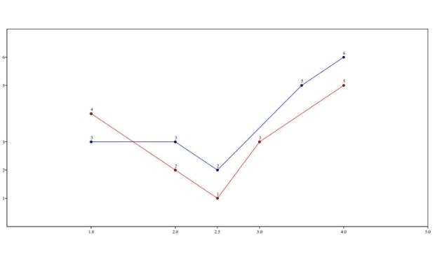
data = [
((1,4), (2,2), (2.5,1), (3,3), (4,5)),
((1,3), (2,3), (2.5,2), (3.5,5), (4,6))
]
lp = LinePlot()
lp.x = 40
lp.y = 50
lp.height = 445
lp.width = 945
lp.data = data
lp.joinedLines = 1
lp.lines[0].symbol = makeMarker('FilledCircle')
lp.lines[1].symbol = makeMarker('Circle')
lp.lineLabelFormat = '%2.0f'
lp.strokeColor = colors.black
lp.xValueAxis.valueMin = 0
lp.xValueAxis.valueMax = 5
lp.xValueAxis.valueSteps = [1, 2, 2.5, 3, 4, 5]
lp.xValueAxis.labelTextFormat = '%2.1f'
lp.yValueAxis.valueMin = 0
lp.yValueAxis.valueMax = 7
lp.yValueAxis.valueSteps = [1, 2, 3, 5, 6]
d.add(lp)
from reportlab.graphics import renderPDF
renderPDF.drawToFile(d, my_path, '')Python PDF Shapes in PDF Bar charts in PDF Pie Charts
PDF Mark sheet by using data from SQLite database

Subhendu Mohapatra
Author
🎥 Join me live on YouTubePassionate about coding and teaching, I publish practical tutorials on PHP, Python, JavaScript, SQL, and web development. My goal is to make learning simple, engaging, and project‑oriented with real examples and source code.
Subscribe to our YouTube Channel here
This article is written by plus2net.com team.
https://www.plus2net.com

 Python Video Tutorials