Pie chart in PDF file
Pie chart in Python PDF using ReportLab with data from SQLite or MySQL database with options
Pie Chart with options
from reportlab.graphics.charts.piecharts import Piepc.data = [10,20,30,40,50,60]
pc.labels = ['a','b','c','d','e','f']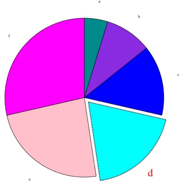
In this format we can collect sample data from SQLite or MySQL database and display the graph.
Full code is here. Different options are explained using the comment section.
from reportlab.lib import colors
my_path='G:\\My drive\\testing\\pypdf2\\my_pdf.pdf'
from reportlab.graphics.shapes import Drawing
from reportlab.graphics.charts.piecharts import Pie
from student_data import my_classes,my_Nos
d=Drawing(800,800) # width, height
pc=Pie()

pc.x = 120
pc.y = 300
pc.width = 400
pc.height = 400
#pc.data = [10,20,30,40,50,60]
#pc.labels = ['a','b','c','d','e','f']
pc.data=my_Nos
pc.labels=my_classes
pc.sideLabels=0
pc.simpleLabels=0
pc.slices.strokeWidth=0.5
pc.slices[3].popout = 10
pc.slices[3].strokeWidth = 2
pc.slices[3].strokeDashArray = [2,2]
pc.slices[3].labelRadius = 1.3
pc.slices[3].fontColor = colors.red
pc.slices[3].fontSize = 26
d.add(pc)

from reportlab.graphics import renderPDF
renderPDF.drawToFile(d, my_path, '')
Pie Chart using data from Database Table
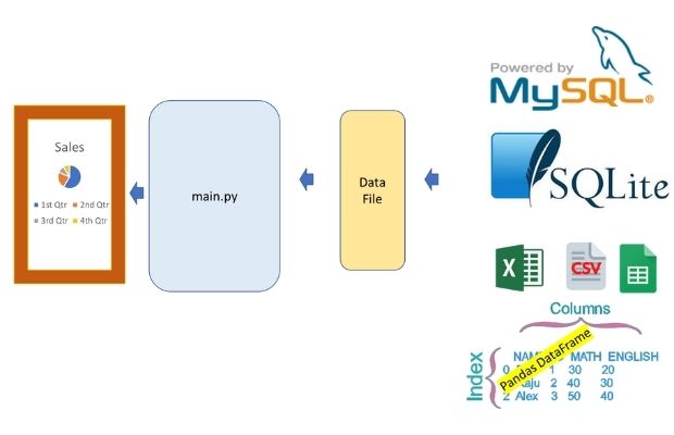
We will use SQLite database student table.
Script can easily changed to get data from MySQL database table.
Download sample SQLite database with student table
We can also use MySQL database.
Full student table with SQL Dump for MySQL database.
student_data.py
from sqlalchemy import create_engine
my_conn = create_engine("sqlite:///G:\\My Drive\\testing\\my_db\\my_db.db")
#my_conn = create_engine("mysql+mysqldb://userid:pw@localhost/my_tutorial")
q="SELECT class,count(*) as no  FROM student GROUP BY class"
my_cursor=my_conn.execute(q)   # getting record set
my_result=my_cursor.fetchall() # create a list
my_classes = [row[0] for row in my_result] # class as list
my_Nos = [row[1] for row in my_result]   # number of student in class as list
# print(my_classes,my_Nos) # for checking outputfrom student_data import my_classes,my_Nospc.data=my_Nos
pc.labels=my_classesfrom reportlab.lib import colors
my_path='G:\\My drive\\testing\\pypdf2\\my_pdf.pdf'
from reportlab.graphics.shapes import Drawing
from reportlab.graphics.charts.piecharts import Pie
from student_data import my_classes,my_Nos
d=Drawing(800,800) # width , height
pc = Pie()
pc.x = 120
pc.y = 300
pc.width = 400
pc.height = 400
#pc.data = [10,20,30,40,50,60]
pc.data=my_Nos
#pc.labels = ['a','b','c','d','e','f']
pc.labels=my_classes
pc.sideLabels=0
pc.simpleLabels=0
pc.slices.strokeWidth=0.5
pc.slices[3].popout = 3
pc.slices[3].strokeWidth = 2
pc.slices[3].strokeDashArray = [2,2]
pc.slices[3].labelRadius = 1.1
pc.slices[3].fontColor = colors.red
pc.slices[3].fontSize = 26
d.add(pc)
from reportlab.graphics import renderPDF
renderPDF.drawToFile(d, my_path, '')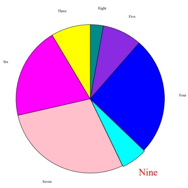
Python PDF Shapes in PDF Bar charts in PDF Line Charts
PDF Mark sheet by using data from SQLite database

Subhendu Mohapatra
Author
🎥 Join me live on YouTubePassionate about coding and teaching, I publish practical tutorials on PHP, Python, JavaScript, SQL, and web development. My goal is to make learning simple, engaging, and project‑oriented with real examples and source code.
Subscribe to our YouTube Channel here
This article is written by plus2net.com team.
https://www.plus2net.com

 Python Video Tutorials