Pandas DataFrame Exercise 1-1
Part I : Creating and grouping data
Create one student mark list with two subjects for 10 ( variable n ) number of students. Marks are given against two subjects and it can vary from 0 to 100. Use random numbers for generating marks. Your DataFrame should have two subject columns Math and Eng. One more column student ID should start from 1 and continue for all students.Add one more column my_result based on mark in the subject Math. Result ( my_result ) to be arranged in the range 0– 39 Fail, 40 – 50 Third, 50 – 75 Second, 75 to 100 First.
Note that if a student gets 40 then he is passed, If he gets 75 then he is to be placed at First division. ( same is to be followed for other groups )
Part II ( Data Visualization)
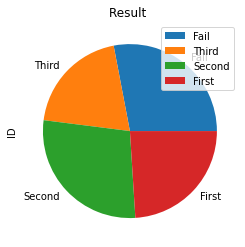
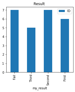
Based on the marks in Math subject plot a scatter graph to show distribution of marks of students.Create one Pie chart showing the result of total class distributed in bins. Similarly create on Bar chart showing the result.
Solution
import numpy as np
import pandas as pd
n=5 # Number of students , increase this number
my_id=np.arange(1,n+1) # student id from 1 to n

my_math=np.random.randint(0,100,size=n) # 0 to 100 random mark
my_english=np.random.randint(0,100,size=n)

my_pd=pd.DataFrame(data=[my_id,my_math,my_english]).T # transpose the matrix

my_pd.columns=['ID','MATH','ENG'] # adding columns to DataFrame
#print(my_pd.to_string(index=None))

my_labels=['Fail','Third','Second','First'] # labels
my_pd['my_result'] = pd.cut(x=my_pd['MATH'],
                            bins=[0,40, 50, 75, 100],
                            labels=my_labels,right=False)
print(my_pd) ID MATH ENG my_result
0 1 98 54 First
1 2 25 29 Fail
2 3 72 25 Second
3 4 26 7 Fail
4 5 78 79 Firstn=25 to get better distribution of data.
Data visualization
To the above code we will add for plotting of graphs.my_pd.plot.scatter(title='Math Vs ID ',x='ID',y='MATH')
my_data=my_pd.groupby(['my_result'])[['ID']].count()
print(my_data)
my_data.plot.pie(title="Result ",y='ID',figsize=(4,4))
my_data.plot.bar(title="Result ",y='ID',figsize=(4,4))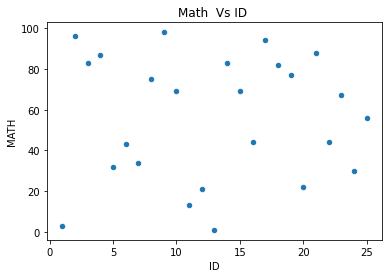
loc mask where query
Pandas Pandas DataFrame iloc - rows and columns by integers

Subhendu Mohapatra
Author
🎥 Join me live on YouTubePassionate about coding and teaching, I publish practical tutorials on PHP, Python, JavaScript, SQL, and web development. My goal is to make learning simple, engaging, and project‑oriented with real examples and source code.
Subscribe to our YouTube Channel here
This article is written by plus2net.com team.
https://www.plus2net.com

 Python Video Tutorials